Showing posts with label data analysis. Show all posts

Saturday, 1 June 2024

A new kind of AutoML: On the fallacy of many-shot in-context learning with LLMs and PLMs

Extension of this post, appear as a short article with a conjecture:

Preamble 
A graph path (Wikipedia)

With the common usage of  Pre-trained Large  Language Models (PLMs/LLMs), now it is possible to direct them to make data analysis, generate predictions or code for very specialised tasks without training. The primary approach in doing such automated analysis is using many-shot learning. In this short post, it is pointed out that pushing analysis into meta model doesn't remove the analyst, as there are now some claims doing so. This is a common generalisation fallacy in many AI systems. Humans are actually are still in the loop and certain automation presented as if human's are removed entirely is not a fair representation of the capabilities and advantages brought by these models. 

How to direct PLMs to do new-prediction without training?

This is quite an attractive premise. Using a foundational model, we could update their ability of prediction beyond training data by simply inducing a memory in their input, so called Chain-of-Though (CoT). At this point, we can deploy the model for an automated task with invoking CoT before its first prompt. This is a new kind of AutoML approach, that supervised learning takes a new great-look: pushes training efforts to building chain-of-thought datasets. Building CoTs appears to be a meta modelling tasks and requires domain knowledge to develop.

Did we really remove the data analyst, software developer or the practitioner from the loop? 

Short answer is No. What we did by is a new way of performing a specialised task, i.e., modelling is moved into a meta modelling stage. Meaning a memory induced by CoT is  designed by experienced human and it will be broken if the task or input data deviates a little differently. A usual culprit in play here; a reliability is problematic. Even though this is quite a promising development and potential to be a game changer on how we practice machine learning, error-rates are still quite high, see Agarwal-Singh et. al. (2024).  

Conclusion 

In this short exposition, we argue that many-shot learning, chain-of-thought learning for foundation models is actually a new kind of AutoML tool. AutoML doesn't imply that human expert is removed from the picture completely. However it greatly assist the scientist, analyst, programmer or practitioner, in automating some tasks as meta programming tool. It will also help less-experienced colleague to start being a bit more productive. These tools indeed improves our computational tool boxes, specifically as a new AutoML tool.  

Further reading

Please cite as follows:

 @misc{suezen24pmlauto, 
     title = {A new kind of AutoML: On the fallacy of many-shot in-context learning with LLMs and PLMs}, 
     howpublished = {\url{https://memosisland.blogspot.com/2024/05/llm-analysis-fallacy.html}, 
     author = {Mehmet Süzen},
     year = {2024}
}  

Sunday, 22 March 2020

Computational Epidemiology and Data Scientists: Don't post analysis on outbreak arbitrarily

Summary

Many data scientist are trained or experienced in using tools to do statistical modelling, forecasting or machine learning solutions, this doesn't necessarily mean that they should just jump out and do an ad-hoc analysis on the available public data on the covid19 outbreak and draw policy conclusions and publish them in their blogs or the other medium.  Rule of thumb of doing such thing you should have at least one published paper, article or software solution related to outbreaks appeared before December 2019. Please be considerate, epidemiological modelling is not merely fitting exponential distribution.

Conclusion
Please refrain on posting a blog or similar posts on infection modelling and giving advice out of your ad-hoc data analysis you did over your lunch-break, if you have not worked on computational epidemiology before. There is a vast academic literature on computational epidemiology. Let people experts in those fields express their modelling efforts first. Let us value expertise in an area.

Appendix: Computational epidemiology introductory resources

Here we provide, limited pointers to computational epidemiology literature. Google Scholar is your friend to find many more resources.

  • Computational Epidemiology
    Madhav Marathe, Anil Kumar S. Vullikanti
    Communications of the ACM, July 2013, Vol. 56 No. 7, Pages 88-96 doi
  • Broadwick: a framework for computational epidemiology
    O’Hare, A., Lycett, S.J., Doherty, T. et al. Broadwick
    BMC Bioinformatics 17, 65 (2016).
    doi
  • Mathematical Tools for Understanding Infectious Disease Dynamics
    (Princeton Series in Theoretical and Computational Biology)
    Odo Diekmann, Hans Heesterbeek, and Tom Britton
    Princeton Press
  • Agent-Based Simulation Tools in Computational Epidemiology
    Patlolla P., Gunupudi V., Mikler A.R., Jacob R.T. (2006)
    doi
  • DIMACS 2002-2011 Special Focus on Computational and Mathematical Epidemiology Rutgers working group
  • Containment strategy for an epidemic based on fluctuations in the SIR model
    Philip Bittihn, Ramin Golestanian
    Oxford/Max Planck
    arXiv:2003.08784
  • SIAM Epidemiology Collection (2020)
  • The collection provided by the American Physical Society (APS) Physical Review COVID-19 collection
  • Modeling epidemics by the lattice Boltzmann method Alessandro De Rosis Phys. Rev. E 102, 023301
  • Implications of vaccination and waning immunity, Heffernan-Keeling,  2009 Jun 7; 276(1664): 2071–2080, url


Saturday, 22 February 2020

A simple and interpretable performance measure for a binary classifier

Kindly reposted to KDnuggets by Gregory Piatetsky-Shapiro 

Preamble

The core application of machine learning models is a binary classification task. This appears in polyhedra of areas from medicine for diagnostic tests to credit risk decision making for consumers.  Techniques in building classifiers vary from simple decision trees to logistic regression and lately super cool deep learning models that leverage multilayered neural networks. However, they are mathematically different in construction and training methodology, when it comes to their performance measure, things get tricky. In this post, we propose a simple and interpretable performance measure for a binary classifier in practice. Some background in classification is assumed. 

Why ROC-AUC is not intepretable? 
PCC in Python (Author). 

De-facto standard in reporting classifier performance is to use Receiver Operating Characteristic (ROC) - Area Under Curve (AUC) measure. It originates from the 1940s during the development of Radar by the US Navy, in measuring the performance of detection.  There are at least 5 different definitions of what does ROC-AUC means and even if you have a PhD in Machine Learning, people have an excessively difficult time to explain what does AUC means as a performance measure. As AUC functionality is available in almost all libraries and it becomes almost like a religious ritual to report in Machine Learning papers as a classification performance. However, its interpretation is not easy, apart from its absurd comparison issues, see hmeasure.  
AUC measures the area under the True Positive Rate (TPR) curve as a function of the False Positive Rate (FPR) that are extracted from confusion matrices with different thresholds, $f(x)=y$ and  $\int_{0}^{1} f(x) dx = AUC$ whereby, y is TPR and x is FPR. Apart from a multitude of interpretations and easy to have confusions, there is no clear purpose of taking the integral over FPR. Obviously, we would like to have perfect classification by having FPR zero, but the area is not mathematically clear. Meaning that what is it as a mathematical object is not clear.

Probability of correct classification (PCC)

A simple and interpretable performance measure for a binary classifier would be great for both highly technical data scientist and non-technical stakeholders. The basic tenant in this direction is that the purpose of a classifier technology is the ability to differentiate two classes. This boils down to a probability value, Probability of correct classification (PCC). An obvious choice is so-called balanced accuracy (BA). This is usually recommended for unbalanced problems, even by SAS; though they used multiplication of probabilities. Here we will call BA as PCC and use addition instead, due to statistical dependence:
$PCC = \alpha TPR+ (1.0-\alpha TNR$

$TPR=TP/(ConditionPositive)=TP/(TP+FN)$
$TNR=TN/(ConditionNegative)=TN/(TN+FP)$
PCC tells us how good the classifier in detecting either of the class and it is a probability value, $[0,1]$. Note that, using total accuracy over both positive and negative cases are misleading, even if our training data is balanced in production, batches we measure the performance may not be balanced so accuracy alone is not a good measure. 

Attentive readers might note that this is about predictive values, Positive and Negative Predictive values, PPV and NPV match with the TPR and TNR respectively.

Production issues
Immediate question would be, how to choose the threshold in generating confusion matrix? One option would be to chose a threshold that maximizes PCC for production on the test set. To improve the estimation of PCC, resampling on the test set can be performed to get a good uncertainty.

Conclusion

We try to circumvent in reporting AUCs by introducing PCC, or balanced accuracy as a simple and interpretable performance measure for a binary classifier. This is easy to explain to a non-technical audience. An improved PCC, that takes into account better estimation properties can be introduced, but the main interpretation remains the same as probability of correct classification.  

Explore the notebook : pcc.ipynb


Please cite as follows:

 @misc{suezen20pcc, 
     title = {A simple and interpretable performance measure for a binary classifier}, 
     howpublished = {\url{https://memosisland.blogspot.com/2020/02/a-simple-and-interpretable-performance.html}, 
     author = {Mehmet Süzen},
     year = {2020}
}  

Thursday, 16 November 2017

Teaching to machines: What is learning in machine learning entails?

Preamble

Ebbinghaus (Wikipedia


Machine Learning (ML)
 is now a de-facto skill for every quantitative job and almost every industry embraced it, even though fundamentals of the field is not new at all. However, what does it mean to teach to a machine? Unfortunately, for even moderate technical people coming from different backgrounds, answer to this question is not apparent in the first instance. This sounds like a conceptual and jargon issue, but it lies in the very success of supervised learning algorithms.

What is a machine in machine learning

First of all here, machine does not mean a machine in conventional sense, but computational modules or set of instructions. It is called machine because of thermodynamics can be applied to analyse this computational modules, their algorithmic complexity can be map to an energy consumption and work production, recall Landauer Principle. Charles Bennett has an article on this principle, here.

Learning curve for machines

What about learning bit? Learning is a natural process for humans, specially for the younger ones. We learn new things naturally without explicitly thinking with instruction and some training, such as practised in University of Bologna a millennia ago. Usually,  it takes time for us to learn new thing, and the process is called learning curve, due to Hermann Ebinghauss. Essentially, learning in machine learning exactly roots in Ebinghauss approach.  But question remains, how this manifests quantitatively in machine learning. Answer to this question is going to be given here.

The concept of learning curve and  effect of sample size in training machine learning models for both experienced and novice practitioners. It is often this type of analysis is omitted in producing supervised learning solutions. In the advent of deep learning architecture, multi-layered neural networks, this concept becomes more pronounced.

Quantifying learning curve lies in measuring performance over increasing experience. If the performance of the machine, or human, increases over experience we denote that learning is achieved. We distinguish good learner.

On the misconception of unsupervised learning


Figure 2: Donald Webb,
father of unsupervised
learning.
(Source: Wikipedia)
A generic misconception appear on what unsupervised learning means. Clustering, or categorising unlabelled data, is not learning in Ebbinghaus sense. The goodness of fit or cluster validation exercise do not account an increase in experience, at least this is not established in the literature, judging from cluster validation techniques, see, Jain-Dubes's Algorithms for clustering data. Wikipedia defines unsupervised learning "inferring a function to describe hidden structure from "unlabeled" data", this is a function inference is not learning,.

Then, what is unsupervised learning? It originates from Hebbian Theory from neuroscience that "Cells that fire together wire together". This implies, unsupervised learning is about how information is encoded, not how it is labelled. One good practical model that could be classified as unsupervised learning, so called spiking network model.

Outlook

The concept of learning from Machine Learning perspective is summarised in this post. In data science, it is a good practice to differentiate what we call learning and function inference/optimisation. Being attentive to this details would help us.


Saturday, 7 January 2017

Practical Kullback-Leibler (KL) Divergence: Discrete Case

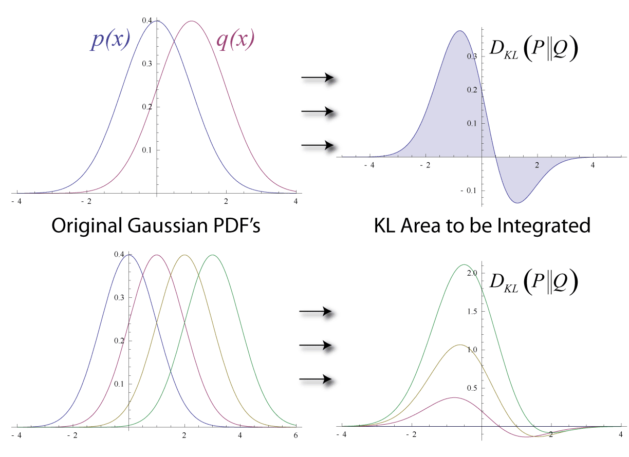
KL divergence (Kullback-Leibler57) or KL distance is non-symmetric measure of difference between two probability distributions. It is related to mutual information and can be used to measure the association between two random variables.

In this short tutorial, I show how to compute KL divergence and mutual information for two categorical variables, interpreted as discrete random variables.

${\bf Definition}$: Kullback-Leibler (KL) Distance on Discrete Distributions

Figure: Distance between two distributions. (Wikipedia)

Given two discrete probability distributions ${\it P}(A)$ and ${\it Q}(B)$ with discrete random variates, $A$ and $B$, having realisations $A=a_{j}$ and $B=b_{j}$, over $n$ singletons $j=1,...,n$. KL divergence or distance $D_{KL}$ in between $P$ and $Q$ is defined as follows:

$D_{KL} = D_{KL}\big({\it P}(A) || {\it Q}(B)\big)=\sum_{j=1}^{n} {\it P}(A=a_{j}) \log \Big(  \cfrac{{\it P}(A=a_{j})}{{\it Q}(B=b_{j})} \Big)$

$\log$ is in base $e$.

${\bf Definition}$: Mutual Information on Discrete Random Variates

Two discrete random variables $X$ and $Y$, having realisations $X=x_{k}$ and $Y=y_{l}$, over $m$ and $n$ singletons $k=1,...,n$ and $l=1,...,m$ respectively, are given. Mutual information, $I(X;Y)$ is defined as follows,

$I(X;Y) = \sum_{k=1}^{n} \sum_{l=1}^{m} {\it R}(X=x_{k}, Y=y_{l}) \log \Big(\cfrac{  {\it R}(X=x_{k}, Y=y_{l})  }{  {\it R}(X=x_{k})  {\it R}(Y=y_{l})} \Big)$

$\log$ is in base $e$ and $R$ denotes probabilities.

${\bf Definition}$: Mutual Information on Discrete Random Variates with KL distance

Two discrete random variables $X$ and $Y$. Mutual information, $I(X;Y)$ is defined as follows,

$I(X;Y) = D_{KL} \Big( {\it R}(X, Y) || {\it R}(X) {\it R}(Y) \Big)$

${\bf Problem: Example}$: Given two discrete random variables $X$ and $Y$ defined on the following sample spaces $(a,b,c)$ and $(d,e)$ respectively. Write down the expression for the mutual information, I(X;Y), expanding summation.

${\bf Solution: Example}$:

$I(X;Y)  = {\it R}(X=a, Y=d) \log \Big(\cfrac{ {\it R}(X=a, Y=d) }{  {\it R}(X=a)  {\it R}(Y=d)} \Big) +$

${\it R}(X=b, Y=d) \log \Big(\cfrac{  {\it R}(X=b, Y=d)  }{  {\it R}(X=b)  {\it R}(Y=d)} \Big)+$

${\it R}(X=c, Y=d) \log \Big(\cfrac{  {\it R}(X=c, Y=d)  }{  {\it R}(X=c)  {\it R}(Y=d)} \Big)+$

${\it R}(X=a, Y=e) \log \Big(\cfrac{  {\it R}(X=a, Y=e)  }{  {\it R}(X=a)  {\it R}(Y=e)} \Big)+$

${\it R}(X=b, Y=e) \log \Big(\cfrac{  {\it R}(X=b, Y=e)  }{  {\it R}(X=b)  {\it R}(Y=e)} \Big)+$

${\it R}(X=c, Y=e) \log \Big(\cfrac{  {\it R}(X=c, Y=e)  }{  {\it R}(X=c)  {\it R}(Y=e)} \Big)$


${\bf Definition}$: Two discrete random variables $X$ and $Y$, having realisations $X=x_{k}$ and $Y=y_{l}$, over $m$ and $n$ singletons $k=1,...,n$ and $l=1,...,m$ respectively, are given. Two-way contingency table of realisations of $X$ and $Y$ along the same measured data points, $N$ observations, can be constructed by counting co-occurances, or cross-classifying factors. Normalizing the resulting frequency table will produce joint and marginal probabilities.

                Y=y_{1}              ...    Y=y_{l}              R(X)
               
    X=x_{1}    R(X=x_{1}, Y=y_{1})   ... R(X=x_{1}, Y=y_{l}) R(X=x_{1})
    X=x_{2}    R(X=x_{2}, Y=y_{1})   ... R(X=x_{2}, Y=y_{l}) R(X=x_{2})
    ...             ...              ...        ...              ...
    X=x_{k}    R(X=x_{k}, Y=y_{1})   ... R(X=x_{k}, Y=y_{1} R(X=x_{k}) 
   
    R(Y)        R(Y=y{1})           ...  R(Y=y_{l})


Simulated example with R


 1
 2
 3
 4
 5
 6
 7
 8
 9
10
11
12
13
14
15
16
17
18
set.seed(3951824)
# Table of counts (contingency)
X <- sample(letters[1:3], 100, 1)
Y <- sample(letters[4:5], 100, 1)
t  <- table(X,Y)
tp  <- t/100 # proportions
tn  <- tp/sum(tp)     # normalized, joints
p_x <- rowSums(tn)    # marginals
p_y <- colSums(tn)

P <- tn 
Q <- p_x %o% p_y 

# P(X, Y)   : bin frequency: P_i
# P(X) P(Y) : bin frequency, Q_i 
mi <- sum(P*log(P/Q))
library(entropy)
mi.empirical(t) == mi

References

(KullbackLeibler57) Kullback, S.; Leibler, R.A. (1951). "On information and sufficiency". Annals of Mathematical Statistics 22 (1): 79–86. 


Monday, 25 July 2016

Economy and dynamic modelling: Haavelmo's approach

Updated on 25 August 2017
Preamable: 
Predictions using dynamic modelling
Machine Learning and  Neural Networks are not the only way to do data science or AI. There are other techniques to explore  , for example, from quantitative economics. Apart from Game Theory, dynamic modelling could be suitable to many prediction problems, specially the ones with temporal datasets. Here is one example technique from  forgotten Norwegian Nobel prize winning economist/data scientist Trygve Haavelmo. Advantage of such models are they can be explained, not fully black box. Make no mistake, for very large system with large datasets, this is not that trivial to implement, GPUs are well suited. In this post we give one hands on exercise.

Summary

Econometrics aims at estimating observables in the economy and their inter-dependencies and testing the estimates against the economic reality. A quantitative approach to express these inter-dependencies appear as simultaneous equations, an i.e. system of linear equations, this is  a mathematical structure of economic relationships that were made possible with the pioneering work of Nobel prize winning economist Trygve Haavelmo [1,2]. This approach and its dynamic variants are now used routinely in dynamic modelling of econometric systems. From a computational perspective, R-project provides efficient and very rich computational environment and the large set of extensions for econometrics in general [3].

Dynamic Modelling

The simplest relationship that can be constructed with two arbitrary economic variables, or instruments, $X(t)$ and $Y(t)$ is shown by Haavelmo [1]. For example, these variables could be unemployment rate and Gross Domestic Product (GDP), as in Okun's law. Hence, the simplest bi-variate simultaneous system of equations looks as follows,

$X(t) =a Y(t) + \epsilon_{x}(t)$,
$Y(t) =b X(t) + \epsilon_{y}(t)$,

where $a$ and $b$ are constant coefficients. Where, $\epsilon_{x}$ and $\epsilon_{y}$, appear as non-deterministic disturbances and are not observed in the modelled economic system. Disturbances are usually expressed as random variables drawn from the normal distribution. At this stage, one can follow two approaches in doing economic scenario analysis for forecasting. We can aim at finding coefficients $a$ and $b$ using economic data via dynamic regression. If $a$ and $b$ coefficients are known, we may want to study effect of different disturbances over time.
Dynamic Haavelmo Model
A model of propensity to consume in economic system is shown by Haavelmo [3] based on his analysis of US economic conditions between 1929-1949. His analysis leads to following simultaneous system of equations,
$c(t)= \alpha y(t) + \beta + u(t)$,
$r(t)= \mu (c(t)+x(t)) +\nu + w(t)$,
$y(t)= c(t)+x(t)-r(t)$,
where $\alpha,\beta,\mu,\nu$ are constants and $u(t)$ and $w(t)$ are disturbances. Economic variables have the following meanings,

c(t) : personal consumption expenditures,
y(t) : personal disposable income,
r(t) : gross business savings,
x(t) : gross investment.

However, this model considered to be static while all the relationships are given at the same time point. Zellner-Palm [5] provided a dynamic version of the Haavelmo's model. Here we write down a version of it,

$c(t)= \alpha Dy(t) + \beta + u(t)$,
$r(t)= \mu D(c(t)+x(t)) +\nu + w(t)$,
$y(t)= c(t)+x(t)-r(t)$. 

where difference operator means, $Dy(t) = y(t)-y(t-1)$.

Krokozhia Case Study

Data

Krokozhia is a fictional country depicted in Steven Spielberg's movie The Terminal. Let's generate a fictional data for our dynamic Haavelmo model's economic instruments for this country from 1950 to present in R,

set.seed(4242)
# KH: Krokozhia Haavelmo Model
KH.df <- data.frame(Year=seq(1950,2013),
c=sample(300:1500,64,replace=TRUE),
y=sample(1000:5000,64,replace=TRUE),

r=sample(100:500,64,replace=TRUE),
x=sample(100:500,64,replace=TRUE))
# Add lag data for difference
KH.df$y.lag <- c(NA, KH.df$y[1:63])
KH.df$c.lag <- c(NA, KH.df$c[1:63])
KH.df$x.lag <- c(NA, KH.df$x[1:63])


Determining Constants

Multilevel regression is needed in order to fit the data and determine the constants of the dynamic model. One R package called sem developed by John Fox can do such analysis.

library(sem)
# Two-stage least squares
#   Eq1: $c(t)= \alpha Dy(t) + \beta + u(t)$,
#         \beta is the intercept and u(t) is not used
#   Eq2: $r(t)= \mu D(c(t)+x(t)) +\nu + w(t)$,
#         \nu is the intercept and w(t) is not used
KH.eq1 <- tsls(c~I(y-y.lag), ~c+y+r, data=KH.df)
KH.eq2 <- tsls(r~I(c-c.lag+x-x.lag), ~c+y+r, data=KH.df)
coef(KH.eq1)  # alpha=875.414  nu=0.015
coef(KH.eq2)  # mu=-0.028      nu=300.675


Here tsls performs two-stage least square analysis.

Propagating a disturbance in the economy

We have not used any disturbance in determining the system coefficients, constants, above. However, we can propagate the values of economic observables using the dynamic model if we set a disturbance value at a given time. Imagine if we set disturbance on the year 2001 as $u=200$ and $w=150$. Hence, the dynamic model will read on year 2001, $t=2001$, $u=200$ and $w=150$

     $c = 875.414 (y-2570) + 0.015 + 200$
     $r = -0.028(c+x-1281-479) + 300.675 + 150$,
     $y = c+x-r$,

By solving this under-determined system of equations we can determine the values in the year 2001 and furthermore propagate all dynamics after 2001 similarly. The resulting new series will give us a quantitative idea of the effect of single disturbance in the simulated economy.

Conclusions and outlook

In this post, we have briefly reviewed possible uses of R in simulating dynamic econometric models, in particular simultaneous equation models. A simple demonstration of determining model coefficients of the Haavelmo type toy model with generated synthetic data is provided. One use case of this type of approach in economic scenario analysis and forecasting is to monitor propagation of the econometric instruments over time is also mentioned.


References

[1] The Statistical Implications of a System of Simultaneous Equations,
     Trygve Haavelmo, Econometrica, Vol. 11, No. 1. (Jan., 1943), pp. 1-12
[2] Econometrics Analysis, William H. Greene, Prentice Hall (2011)
[3] Applied Econometrics with R,
     Kleiber, Christian, Zeileis, Achim, Springer (2008), Achim Zeileis
[4] Methods of measuring the marginal propensity to consume,
     T. Haavelmo, Journal of the American Statistical Association,
     1947 - Taylor & Francis.
[5] Time series analysis and simultaneous equation econometric models,
      Zellner, Arnold and Palm, Franz, Journal of Econometrics,
      Vol.2, Num.1, p17-54 (1974)

Saturday, 16 January 2016

S-shaped data: Smoothing with quasibinomial distribution

Figure 1: Synthetic data and fitted curves.
S-shaped distributed data can be found in many applications. Such data can be approximated with logistic distribution function [1].  Cumulative distribution function of logistic distribution function is a logistic function, i.e., logit.

To demonstrate this, in this short example, after generating a synthetic data, we will fit quasibinomial regression model to different observations.

ggplot [2], an implementation of grammar of graphics [3], provides capability to apply regression or customised smoothing onto a raw data during plotting.

Generating Synthetic Data

Let generate set of $n$ observation over time $t$, denoted, $X_{1}, X_{2}, ..., X_{n}$ for $k$ observation $X=(x_{1}, x_{2}, ..., x_{k})$. We will use cumulative function for logistic distribution [4],
$$F(x;\mu,s) = \frac{1}{2} + \frac{1}{2} \tanh((x-\mu)/2s)$$, adding some random noise to make
it realistic.

Let's say there are $k=6$ observations with the following parameter sets, $\mu = \{9,2,3,5,7,5\}$  and $s=\{2,2,4,3,4,2\}$, we will utilise `mapply` [5] in generating a syntetic data frame.


generate_logit_cdf <- function(mu, s, 
                               sigma_y=0.1, 
                               x=seq(-5,20,0.1)) {
  x_ms <- (x-mu)/s
  y    <- 0.5 + 0.5 * tanh(x_ms)  
  y    <- abs(y + rnorm(length(x), 0, sigma_y))
  ix   <- which(y>=1.0)
  if(length(ix)>=1) { 
    y[ix] <- 1.0
  }
  return(y)
}
set.seed(424242)
x      <- seq(-5,20,0.025) # 1001 observation
mu_vec <- c(1,2,3,5,7,8)   # 6 variables
s_vec  <- c(2,2,4,3,4,2)
# Syntetic variables
observations_df<- mapply(generate_logit_cdf, 
                              mu_vec, 
                              s_vec, 
                              MoreArgs = list(x=x))
# Give them names
colnames(observations_df) <- c("Var1", "Var2", "Var3", "Var4", "Var5", "Var6")
head(observations_df)  

Smoothing of observations

Using the syntetic data we have generated, `observations_df`,
we can noq use `ggplot` and `quasibinomial` `glm` to visualise
and smooth the variables.


library(ggplot2)
 library(reshape2)
 df_all <- reshape2:::melt(observations_df)
 colnames(df_all) <- c("x", "observation", "y")
 df_all$observation <- as.factor(df_all$observation)
 p1<-ggplot(df_all, aes(x=x, y=y, colour=observation)) + geom_point() + 
        scale_color_brewer(palette = "Reds") +
        theme(
              panel.background = element_blank(), 
              axis.text.x      = element_text(face="bold", color="#000000", size=11),
              axis.text.y      = element_text(face="bold", color="#000000", size=11),
              axis.title.x     = element_text(face="bold", color="#000000", size=11),
              axis.title.y     = element_text(face="bold", color="#000000", size=11)
#              legend.position = "none"
              )
 l1<-ggplot(df_all, aes(x=x, y=y, colour=observation)) +
        geom_point(size=3) + scale_color_brewer(palette = "Reds") + 
        scale_color_brewer(palette = "Reds") + 
        #geom_smooth(method="loess", se = FALSE, size=1.5) +
        geom_smooth(aes(group=observation),method="glm", family=quasibinomial(), formula="y~x",
                       se = FALSE, size=1.5) +
        xlab("x") + 
        ylab("y") +
        #scale_y_continuous(breaks=seq(0.0,1,0.1)) +
        #scale_x_continuous(breaks=seq(0.0,230,20)) +
        #ggtitle("")  + 
        theme(
              panel.background = element_blank(), 
              axis.text.x      = element_text(face="bold", color="#000000", size=11),
              axis.text.y      = element_text(face="bold", color="#000000", size=11),
              axis.title.x     = element_text(face="bold", color="#000000", size=11),
              axis.title.y     = element_text(face="bold", color="#000000", size=11)
              )
 library(gridExtra)
 gridExtra:::grid.arrange(p1,l1)


References
[1] https://en.wikipedia.org/wiki/Logistic_distribution#Applications
[2] http://www.ggplot.org
[3] The Grammar of Graphics, L. Wilkinson, http://www.amzn.com/038724544
[4] http://en.wikipedia.org/wiki/Logistic_distribution#Cumulative_distribution_function.
[5] https://stat.ethz.ch/R-manual/R-devel/library/base/html/mapply.html

Notes:
* Quasibinomial distribution is as a term used in R's GLM implementation context, see here.


Friday, 10 April 2015

Scale back or transform back multiple linear regression coefficients: Arbitrary case with ridge regression

Summary

The common case in data science or machine learning applications, different features or predictors manifest them in different scales. This could bring difficulty in interpreting the resulting coefficients of linear regression, such as one feature having very large or small values compare to other predictors and being in different units first of all. The common approach to overcome this to use z-score's for each features, centring and scaling.

This approach would allow us to interpret the effects.  A possible question however is how could we map regression coefficients obtained with the scaled data back to original coefficients. In the context of ridge regression, this question is posed by Mark Seeto in the R mailing list and provided a solution for two predictor case with an R code. In this post we formalize his approach. Note that, in the case of how to scale, Professor Gelman suggests dividing them by two standard deviations. In this post we won't cover that approach and use usual approach.

Algebraic Solution: No error term

An arbitrary linear regression for $n$ variable reads as follows
$$y=(\Sigma_{i=1}^n   \beta_{i} x_{i}) + \beta_{0}$$
here, $y$ is being response variable, $x_{i}$ are the predictors, $n=1,..,n$. Let's use primes for the scaled regression equation  for $n$ variable.
$$y'=(\Sigma_{i=1}^n   \beta_{i}' x_{i}') + \beta_{0}'$$
We would like to express $\beta_{i}$ by only using $\beta_{i}'$ and two statistic from the data, namely mean and standard deviations, $\mu_{x_{i}}$, $\mu_{y}$, $\sigma_{x_{i}}$ and $\sigma_{y}$.

The following transformation can be shown by using the z-scores and some algebra,

$$\beta_{0}=\beta_{0}' \sigma_{y} + \mu_{y} - \Sigma_{i=1}^{n} \frac{\sigma_{y}}{\sigma_{x_{i}}}\beta_{i}' \mu_{x_{i}}$$
$$\beta_{i} = \beta_{i}' \frac{\sigma_{y}}{\sigma_{x_{i}}}$$ 

Ridge regression in R

There are many packages and tools in R to perform ridge regression. One of the prominent one is glmnet. Following Mark Seeto's example, here we extent that in to many variate case with a helper function scaleBack.lm from R1magic package.  Function provides a transform utility for $n$-variate case. Here we demo this using 6 predictors, also available as gist,


rm(list=ls())
library(glmnet)
library(R1magic) # https://github.com/msuzen/R1magic
set.seed(4242)
n <- 100 # observations
X <- model.matrix(~., data.frame(x1 = rnorm(n, 1, 1),
                                 x2 = rnorm(n, 2, 2),
                                 x3 = rnorm(n, 3,2),
                                 x4 = rnorm(n, 4,2),
                                 x5 = rnorm(n, 5,1),
                                 x6 = rnorm(n, 6,1)
                                ))[,-1] # glmnet adds the intercept
Y          <- matrix(rnorm(n, 1, 2),n,1)
# Now apply scaling 
X.s        <- scale(X)
Y.s        <- scale(Y)
# Ridge regression & coefficients with scaled data
glm.fit.s    <- glmnet(X.s, Y.s, alpha=0)
betas.scaled <- as.matrix(as.vector(coef(glm.fit.s)[,80]), 1, 7)
# trasform the coefficients 
betas.transformed <- scaleBack.lm(X, Y, betas.scaled)
# Now verify the correctness of scaled coefficients: 
# ridge regression & coefficients
glm.fit    <- glmnet(X, Y, alpha=0)
betas.fit  <- as.matrix(as.vector(coef(glm.fit)[,80]), 1, 7)
# Verify correctness: Difference is smaller than 1e-12
sum(betas.fit-betas.transformed) < 1e-12 # TRUE

Conclusion

Multiple regression is used by many practitioners. In this post we have shown how to scale continuous predictors and transform back the regression coefficients to original scale. Scaled coefficients would help us to better interpret the results. The question of when to standardize the data is a different issue.

Wednesday, 7 May 2014

Euclid Algorithm for Set of Integers: 'Reduce' vs. trees in R

The Euclid Algorithm provides a solution to the greatest common divisor (GCD) of two natural numbers $x_{1}$ and $x_{-2}$, denoted by $GCD(x_{1}, x_{2})$. This will produce the largest integer that divides $x_{1}$ and $x_{2}$. Solution is proposed by Euclid of Ancient Greece. This can be formulated as a recurrence relation:
$$x_{k} = x_{k-1}  modulo  x_{k-2}.$$
'modulo' binary operation returns the remainder from a given division. Stopping criterion for the recurrence relation is reached when $x_{k-2}=0$ and the result of GCD will be the current value of $x_{k-1}$. This process can be visualised as successive divisions. Let's implement this in R in a naive way.

# Naive Euclid algorithm by msuzen
gcd <- function(a, b)
{
  rk_1 <- a;
  rk_2 <- b;
  # Recurrence Formula:  r_k =  r_k-1 modulo r_k-2
  # Increment k until r_k-2 == 0 
  while(rk_2 != 0) {
    rk      <- rk_1%%rk_2; # remainder
    rk_1    <- rk_2;       # proceed in recurrence
    rk_2    <- rk;
  }
  return(rk_1)
}

This is a straight forward task. Let's make the problem little more generic. What happends if we would like to know GCD of $n$ natural numbers, $x_{1},..., x_{n}$? Than, a solution is to apply GCD operation pairwise, for example if $n=3$:
$$GCD(x_{1}, GCD(x_{2}, x_{3})) = GCD(GCD(x_{1}, x_{2}), x_{3})$$
How can we implement this for a vector of non-negative integers?

Tree Approach

The simplest way to reach GCD of $n$ numbers is probably thinking of this process as a binary tree, formed by pairing elements of set of integers as we obtain GCDs. It is relatively easy to implement this because ordering of pairs is not important. We can start from the beginning and pair up as we obtain the results. Here is the naive implementation.

1
2
3
4
5
6
7
8
gcdN <- function(X) {
  n      <- length(X)
  gcdEnd <- X[1]
  for(i in 2:n) {
     gcdEnd <- gcd(gcdEnd, X[i])
  } 
  return(gcdEnd)
}

'Reduce' operation 

So called tree approach we have given above is actually noting but a Reduce operation in the context of MapReduce. The function gcdN can be replaced with a single line.
Reduce("gcd", X)
This example looks trivial but having Reduce and friends in our programming toolbox makes our life a little easier. Noting so novel here! But it could saves us time not to implement tree like algorithm.

Sunday, 8 September 2013

Weighted Histograms: MATLAB or Octave

Histograms are widely used in exploratory data analysis.  In some applications, such as Monte Carlo simulations, sometimes the data or the distribution manifest with corresponding weights, for example in the analysis of  umbrella sampling results. In those situations weights of each data point should be taken into account in constructing histograms out of data points.  If you are programming with R,  weights package would help you to do this. Recently, I have added small utility function in mathworks file exchange called Generate Weighted Histograms to plot weighted histograms. In this post, I would like to demonstrate how these function can be used. Let's generate some synthetic data, which contains values and corresponding weights and find the weighted histogram.

1
2
3
4
5
6
7
% Generate synthetic data
myData.values = rand(100,1); 
myData.weights = rand(100,1);
% Generate weighted histogram
[histw, vinterval] = histwc(myData.values, myData.weights, 10);
% Visualize
bar(vinterval, histw) 
This trivial example demonstrate the usage of histwc function. One can adjust the bins as the third argument of the function.


(c) Copyright 2008-2024 Mehmet Suzen (suzen at acm dot org)

Creative Commons License
This work is licensed under a Creative Commons Attribution 4.0 International License